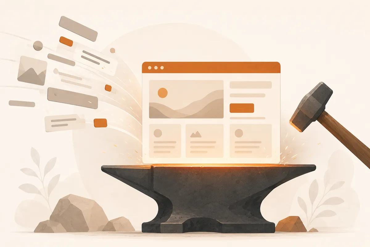
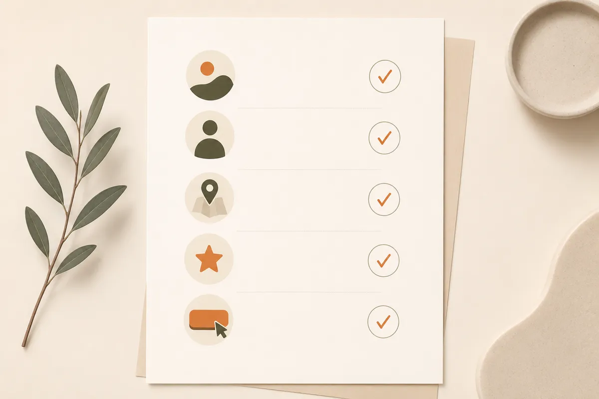
A small business website needs ten things to do its job: say what you do, prove you're real, make it easy to get in touch, work on a phone, load fast, stay secure, show up in search, capture leads, look like you, and be easy to update. Get those right and you're ahead of most sites in your category. Everything else is a nice-to-have.
Here's the honest version of the checklist. I've ranked these roughly by how much they matter, and I'll tell you where you can relax.
A clear statement of what you do
The first thing a visitor wants to know is whether they're in the right place. Your homepage should answer that in one short line, above the fold, before anyone scrolls. "Plumber serving North London, same-day callouts" beats "Welcome to our website" every time.
Be specific about who you help and where. A bakery in Lisbon doesn't need to say "we make delicious products." It needs to say "fresh sourdough and custom cakes in Alfama, order by 6pm for next-day." If a stranger can't tell what you sell in five seconds, the prettiest design in the world won't save you.
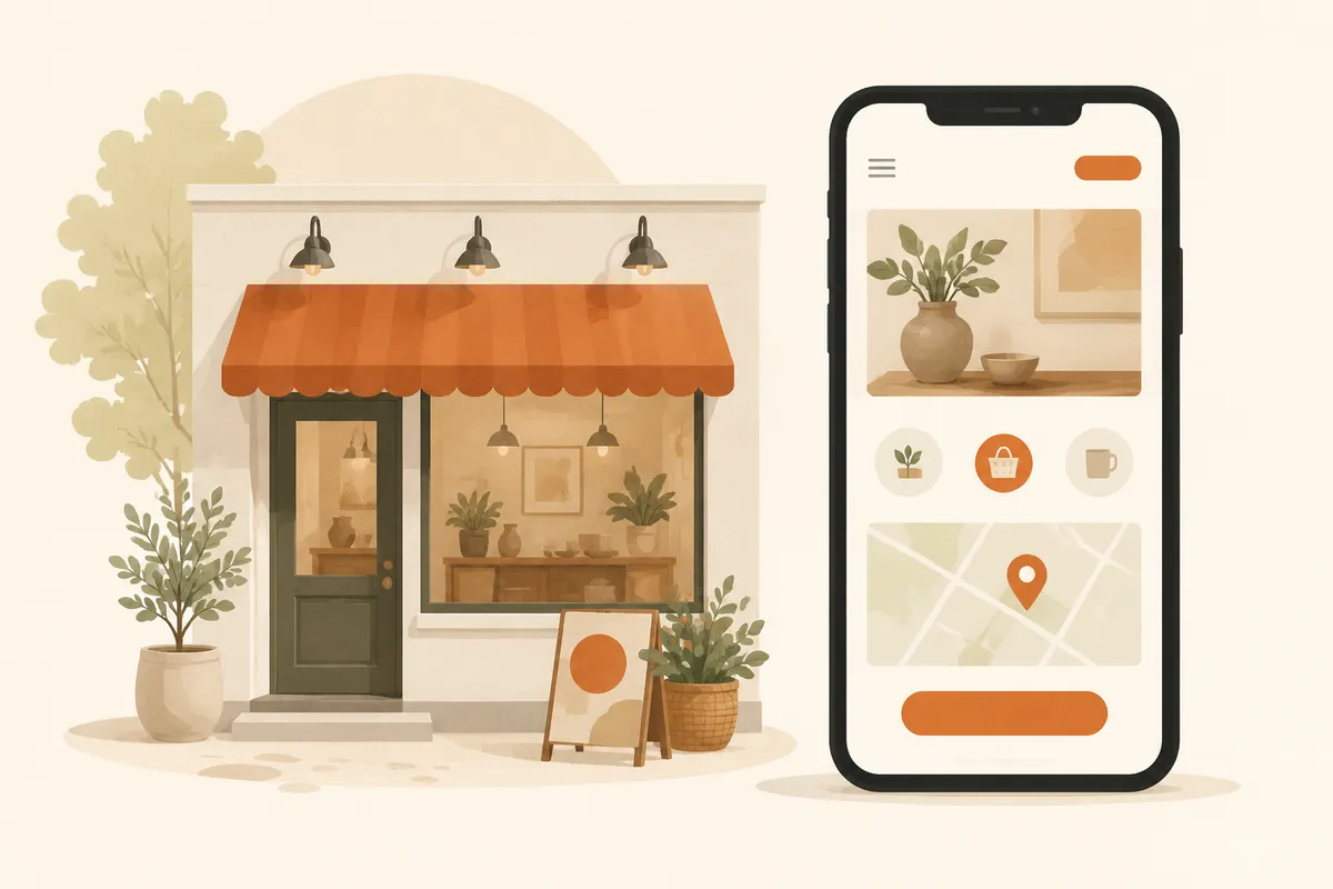
Visible, working contact information
Sounds obvious. It's the most commonly broken thing on small business sites. Your phone number, email, and location should be easy to find, ideally in the header and footer, and they should actually be correct.
Make the phone number tappable on mobile so a thumb-press starts the call. If you have a physical location, embed a map so people can get directions without copying an address. And test it yourself from your own phone before you celebrate. A dead contact link is a customer who quietly went to a competitor.
Proof that you're a real, trustworthy business
Strangers don't trust claims; they trust evidence. Reviews, testimonials, before-and-after photos, logos of clients you've worked with, a real photo of you or your team. Pick whatever's true and put it where people can see it.
You don't need fifty reviews. Three honest ones with names beat a wall of anonymous five-star ratings nobody believes. A dentist showing real patient before-and-afters, a contractor showing finished projects, a consultant showing a short client quote: that's the stuff that turns a maybe into a yes.
Mobile-friendly design
More than half of the people landing on your site are on a phone, and for local businesses that share goes even higher. If your text is tiny, your buttons are unmissable, or visitors have to pinch and zoom, they'll leave.
This isn't optional in 2026. Check your site on an actual phone, not just a shrunken browser window. Tap every button. Fill in every form with your thumbs. Good builders handle responsive layouts automatically, so you mostly need to verify it works rather than code it. If you're starting from scratch, our templates are built mobile-first so you don't have to think about it.
Fast loading speed
People decide whether to stay within a couple of seconds. A slow site loses visitors before they ever see your offer, and search engines notice slow sites too. Speed is one of those quiet things that costs you customers without ever telling you why.
The usual culprits are simple: enormous unoptimized images, autoplay video, a stack of plugins and tracking scripts you forgot you added. Compress your images. Drop the giant background video. Keep third-party scripts to the ones you genuinely use. If you want the deeper version, our guide on website SEO basics covers speed alongside the rest.
HTTPS and basic security
Your site needs an SSL certificate, the thing that puts the little padlock and the "https" in the address bar. Without it, browsers flash a "Not Secure" warning that scares people off, and forms won't feel safe to fill in.
The good news: this is mostly handled for you now. Most modern hosting and website builders include HTTPS by default at no extra cost. Just confirm it's on. Visit your own site and look for the padlock. If you see a warning, fix it before you do anything else, because nothing else matters if visitors don't feel safe.
A clear path to take action
Every page should have an obvious next step. Call now. Get a quote. Book a table. Order on WhatsApp. Don't make people guess what to do; tell them, and make the button big and impossible to miss.
One strong call to action beats five competing ones. A landscaper's page that says "Get a free quote" with a single button converts better than a page cluttered with newsletter signups, social follows, and a contact form all fighting for attention. Decide the one thing you want a visitor to do, and design the page around it.
A way to capture and respond to leads fast
A contact form is only useful if someone actually replies, quickly. The gap between "customer submits form" and "you reply" is where most small business sales leak out. If a form dumps into an inbox you check twice a day, you've lost half your leads to whoever answered first.
This is where routing matters. Sending form submissions straight to WhatsApp means you get a ping on the phone in your pocket and reply in minutes. That's a real edge for a small team. We wrote a full walkthrough on how to turn visitors into WhatsApp leads if you want the setup. With Forgelo, lead forms route to WhatsApp out of the box, which is the whole point.
Basic SEO so people can find you
If nobody can find your site, it doesn't matter how good it is. You don't need to become an SEO expert. You need the fundamentals: a clear page title, a short description for search results, headings that describe each section, image alt text, and content that uses the words your customers actually search for.
For a local business, this means naming your town and your service plainly. "Wedding photographer in Austin" should appear in your title and on the page, not buried in a clever tagline. Built-in SEO settings make this less of a chore; see how Forgelo handles it on our features page. Done right, the basics get you most of the way there.
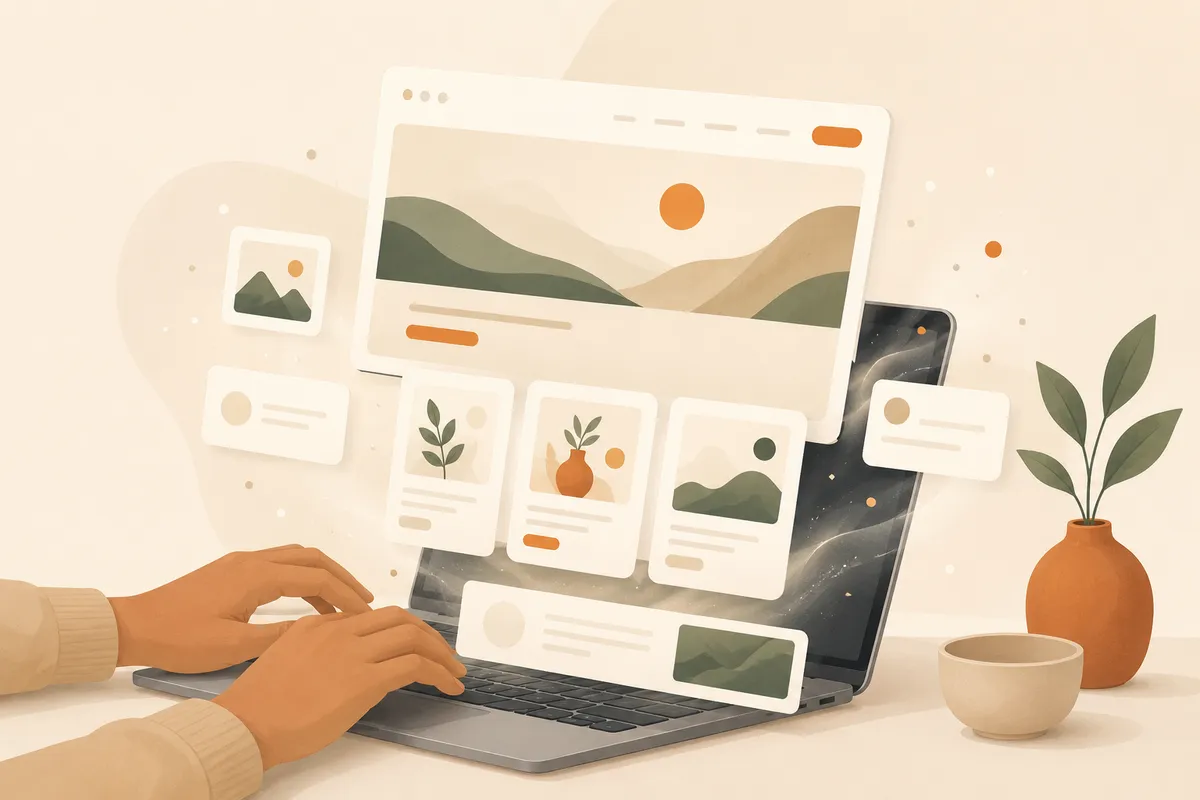
A design that looks like you and is easy to update
Your site should feel like your business, not a generic template fresh out of the box. Your colors, your logo, real photos of your work or your space. People can smell a stock-photo placeholder site, and it makes you look temporary.
Just as important: you need to be able to change things yourself. Prices shift, hours change, you launch a new service. If every small edit means emailing a developer and waiting three days, your site goes stale. The whole appeal of newer AI website builders is that you edit a section by describing what you want in plain words. That's how a site stays current instead of frozen the day it launched.
What you can skip, at least for now
Some things feel essential but aren't, especially at the start. A blog you won't maintain. A live chat widget nobody staffs. Animations that slow the page down. A custom-coded design when a clean template would do the same job in a fraction of the time.
Start with the ten essentials above. Get a real site live, then improve it. A simple site that's online and works beats a perfect site that's still "almost ready" six months later. If you're weighing build options, our pricing and how it works pages lay out the fast path, and you can spin up a working site without writing a line of code.
The takeaway is plain: most small business websites fail not because they lack fancy features, but because they miss the basics. Say what you do, prove you're real, make it easy and fast to contact you, and put a clear next step in front of every visitor. Do those well and you've already beaten most of your competitors online.